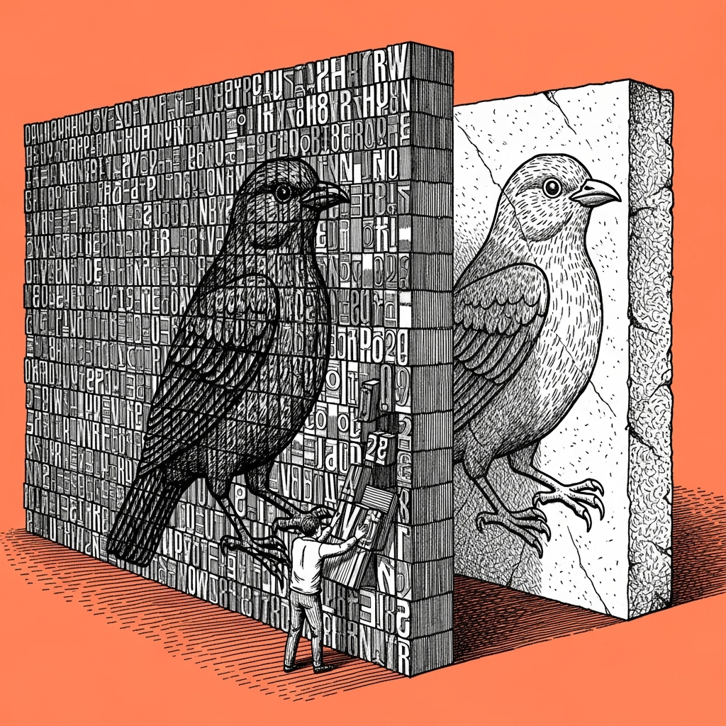
The agent is not choosing colors out of taste, it is reproducing the most common combination it saw in training, which is why every design it hands you drifts toward the same brown, orange, beige and black palette. The way to break that is not to ask for "another variation" or "something more original," it is to lock in an exact color code and a visual reference before it writes a single line.
This happens because a model answering an underspecified brief responds with the statistical center of gravity of everything it has seen, and in design that combination skews toward warm neutral tones that repeat constantly across its source material. The bias is built into the house style, not a wording failure, which is why asking again for "something more original" fixes nothing, it only sends the model back to guess inside the same statistical hole.
For us this became a working direction instead of a problem: every image the team publishes is locked in advance to one fixed background hue and black ink only, no gray scale in between (think of it as the agent's comfort food, when nobody asks for anything specific it goes back to the plate it knows best). We picked one direction and locked it instead of fighting the model's pull, because once the choice is no longer open the agent stops guessing. The same move works on any other project: two visual references and an exact color code before the first request, not after the result already came out brown.
The practical step: one or two images from your brand, plus its exact color codes, go into the first request, not the correction request (and once someone sends "make it more on-brand" on round two, they have already lost, because the model just returns to the same average it started from). Simple test: if the palette is not explicitly locked in the first prompt, it will converge to brown-orange-beige by the end of the project.
A prompt, on the house
Before you design anything new for me (logo, deck, image, interface):

1. I am attaching one or two visual examples of my brand, and its exact
   color codes (hex).
2. Use only these colors, and do not add another shade on your own,
   even if it looks "complementary" to you.
3. If I have not given you an example or color code right now, say so
   explicitly and wait, instead of choosing for me.
4. At the end, mark which color from the list was used where.